
mcvitie's Case study
package redesign — U.K. to U.S. market
McVitie’s Biscuits are a beloved staple in British households, the average Brit enjoys about two a day with their tea. As someone who grew up in England, this project was both personal and strategic: how do you introduce one of your favorite treats to an American audience that isn’t exactly lining up to eat something called a “digestive”?
I redesigned the packaging with American women in mind, particularly those embracing the growing trend of afternoon tea. As drinking culture shifts among younger generations, tea rooms and tea rituals have started popping up in more and more U.S. cities. My goal was to create packaging that felt charming, elegant, and culturally inviting.
Since McVitie’s doesn’t carry strong brand recognition in the States, I incorporated a watercolor illustration of Big Ben and a Union Jack element into the logo, subtle nods to its British heritage while keeping things fresh and shelf-friendly.
This project was about translating tradition for a new audience in a way that feels warm, approachable, and just a little cheeky.
Original package / redesign comparison


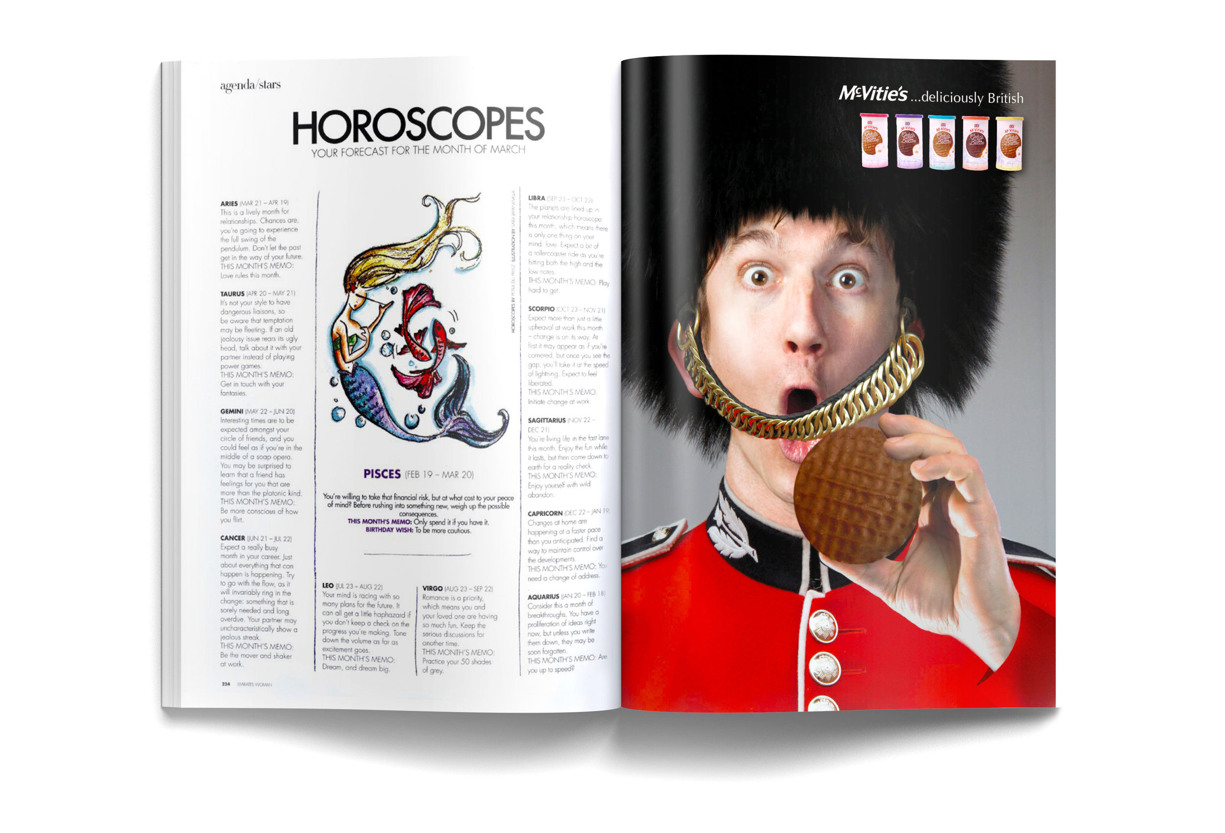
Magazine Advertisement


sketches and rough thoughts


